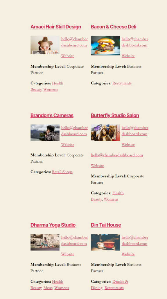
Building responsive layouts using CSS Grid and Flexbox is easy. Few lines of CSS and the columns resize nicely based on the width of the page. CSS Grid or Flexbox takes care of resizing and the columns nicely stack as needed in smaller view ports. We can style these columns using media queries for different browser widths. If we want to add styles based on the number of columns showing on the page though, we need to use JavaScript.
When I was working on converting the Business Directory shortcode to a Gutenberg block, we added options to select the image size. This was a new option which was not in the shortcode. So, the users could choose the number of columns, the image to display (featured image or logo) and the size of the image along with other options while displaying their business directory listings.
They have the option to choose from 1, 2, 3 or 4 column layout or a responsive layout. When it came to styling the images and the text around it, it was not easy. We had to maintain consistency between the specific column layouts and the responsive layout.
The columns in the responsive layouts change based on the width of the page or the content width. We wanted the listings to look consistent in all formats. If the page had only one column, it should show similar to the one column layout, and if the page had 2, 3 or 4 columns, it should show similar to the other column layouts respectively.
This could probably be done using media queries, but it is not easy. The number of columns showing on the page depends on the width of the device and the with of the page itself, or to be specific, the content width of the page. If we used the Twenty Twenty theme with the default page layout, even on a desktop, the content width is smaller and the number of columns would be different when using the responsive layout.
Business Directory layouts with default and full width pages


Adding custom classes using JavaScript
To make the styling of the responsive columns easier, I used JavaScript to add specific classes to the responsive columns. gridColumnCount gives us the number of columns being displayed on the page. The outputGridData function adds the desired classes the specific selector. This function is being called when the page loads and also when the browsers is resized. So, the columnCount gets updated when the page width changes.
function getGridData () {
  // calc computed style
const gridComputedStyle = window.getComputedStyle(businesslist);

  return {
    // get number of grid rows
    gridRowCount: gridComputedStyle.getPropertyValue("grid-template-rows").split(" ").length,
    // get number of grid columns
    gridColumnCount: gridComputedStyle.getPropertyValue("grid-template-columns").split(" ").length,
    // get grid row sizes
    gridRowSizes: gridComputedStyle.getPropertyValue("grid-template-rows").split(" ").map(parseFloat),
    // get grid column sizes
    gridColumnSizes: gridComputedStyle.getPropertyValue("grid-template-columns").split(" ").map(parseFloat)
  }
}

window.addEventListener("DOMContentLoaded", outputGridData);
window.addEventListener("resize", outputGridData);

function outputGridData () {
  const gridData = getGridData();
  const columnCount = gridData.gridColumnCount;
  var images = document.querySelectorAll("#businesslist.responsive.cd_block .business .description a");
  //alert(images);
  for (i = 0; i < images.length; ++i) {
    images[i].className = "grid"+columnCount;
  }
}
The code adds the class grid1, grid2 etc to the specific selector. In this case, it is the “a” tag that holds the featured image or the logo. Once the classes are in place, adding styles is simple.
This ensures that no matter the page width, content width or the device width, the layouts will be consistent based on the number of columns being displayed. The image styles are dependent on the number of columns being displayed on the page. If the screen width is 1200px, but only two columns are displayed, images get floated to the left and the content floats around it.
