Scrap-booking has been my hobby since 2005. It is relaxing and I get to re-live all the fun while putting the pictures together.
I tried a few digital scrapbooks and I loved the ease with which we can put together a page. Adding those digital layouts as part of our blog is easy, but if I want to change something, it is not a simple process.
The new Gutenberg editor now offers ways for us to incorporate cool layouts in our posts and pages. I have been experimenting a lot with Gutenberg lately and I created this simple layout to display some travel pictures of our recent trip.
The Final layout

The above layout requires a few Gutenberg blocks and a little bit of custom CSS. Here is how I built this layout.
Blocks used for the layout
The entire layout is a ‘Group Block’ with a cover block and columns block inside. The columns block has three columns. The cover block holds the big image and the three columns hold the 3 small images.

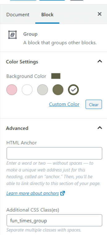
The nice thing about the group block is that we can add a custom background color. I chose the same color as the background color of my site. I added a custom css class to the group block – ‘fun_times_group’ and chose the ‘wide width’ option.
The cover block inside the group block has the main image as the background. The cover block was also set to ‘wide width’ with all other default settings, a solid color overlay with 30% background opacity.
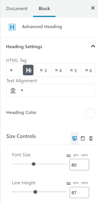
Inside the cover block, I added a heading block and columns block with six columns. For the heading block, I used the ‘Advanced Heading Block‘ form Kadence Blocks plugin. This plugin offers some advanced options for many of the core blocks and some nice to use layouts as well. The advanced heading blocks let me customize the font. The regular heading font coming from the theme is okay, but since this was supposed to be a fun layout, I opted for a fancy font.
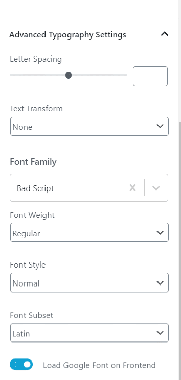
The font I used here is the ‘Bad Script’ with font size of 80px and a line height of 87px. The text is center aligned. The rest of the settings were left as default.


The six columns below the cover block are the ones that give the stripes on the big image. I added a custom class to the columns block (the one that is inside the cover block) – ‘top_columns’. Each of these columns has a left border and the last column also has a right border 10px wide. I chose the background color of the group block as the border color for the columns. This shows up nicely as stripes over the image. Everything else is done with CSS. I adjusted the z-index values to show the font over the stripes.
The lower columns block (the one with 3 columns) has the custom class ’tilted_images’. I added an image to to each of the columns and added custom classes to the left and right images – ‘left_image’ and ‘right_image’ respectively. The image tilt is done with the CSS transform property.
Custom CSS
The custom CSS used for the image rotation and the stripes can be added in the Appearance -> Customize -> Custom CSS.
[css]
/*Adjust the minimum height, top and bottom margins to get the stripes to span the entire height of the image*/
.top_columns .wp-block-column{
border-left: #5C5C42 10px solid; /*this is the color of the stripes*/
min-height: 500px;
margin-top: -50%;
margin-bottom: -20%;
z-index:-10;
}
.top_columns .wp-block-column:last-child{
border-right:#5C5C42 10px solid; /*This is the last stripe to the right*/
}
/*This moves all the 3 images to the top*/
.fun_times_group .wp-block-columns.tilted_images{
margin-top:-10%;
}
.tilted_images .wp-block-column{
z-index:10;
}
.tilted_images .wp-block-image.left_image{
transform: rotate(-10deg);
}
.tilted_images .wp-block-image.right_image{
transform: rotate(5deg);
}
[/css]

2 replies on “Fun Scrapbook Layout with Gutenberg”
If you are willing to answer, it isn’t clear to me how you put the advanced header on top of the columns.
I adjusted the z-index values of the columns block and the advanced header block so that the header is on top of the columns.