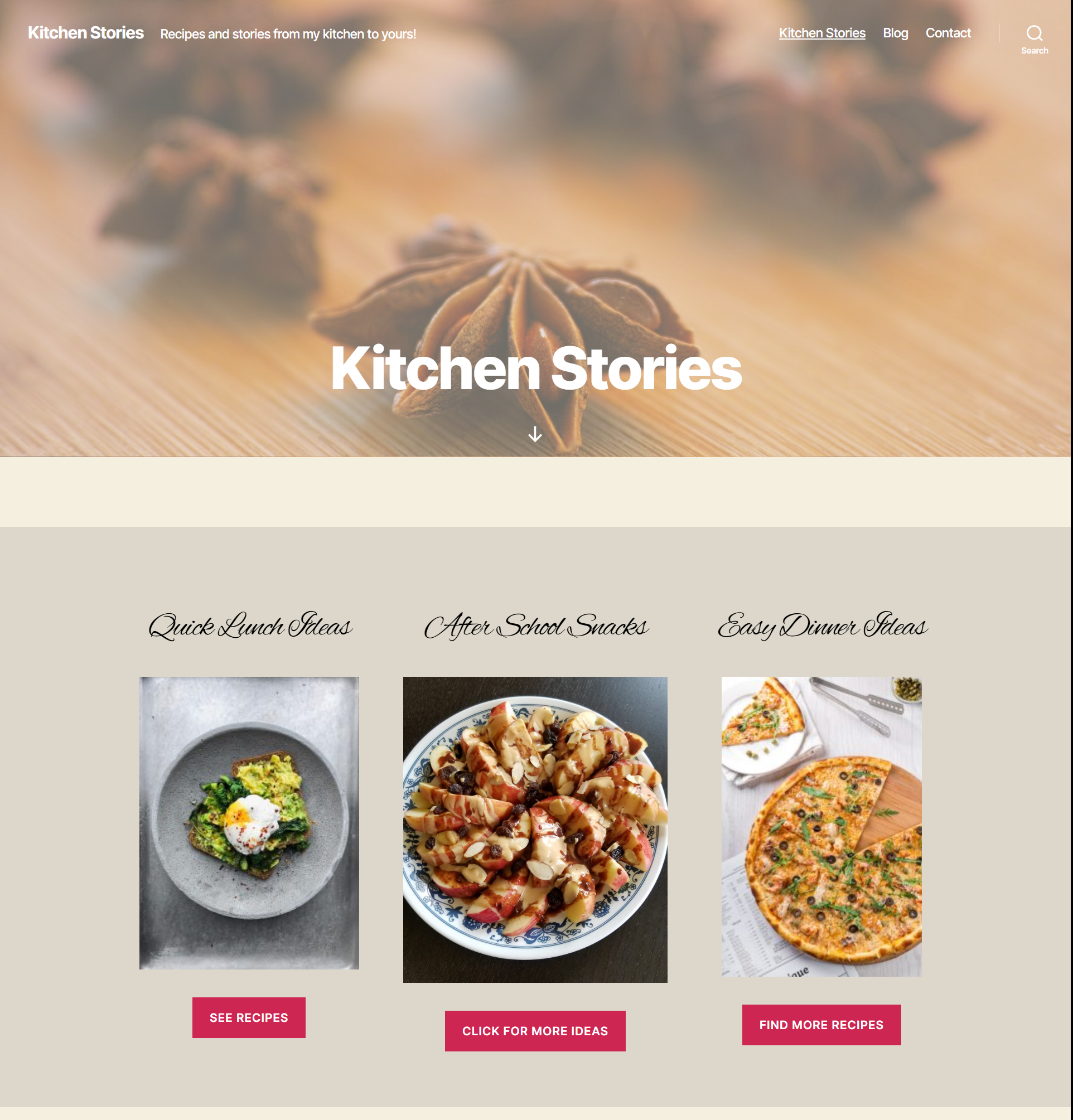
This food blog home page layout is a simple layout that works well for the home page of a food blog.
This has been put together using the TwentyTwenty theme and the block editor. TwentyTwenty is the default WordPress theme and has awesome support for the block editor.
The layout has multiple blocks that include some of the core WordPress blocks and some blocks from other block plugins.
The colors in this layout are very neutral and help bring out the vibrant colors of the recipe images.
Click on the image to see the entire page layout.
Blocks used for this layout
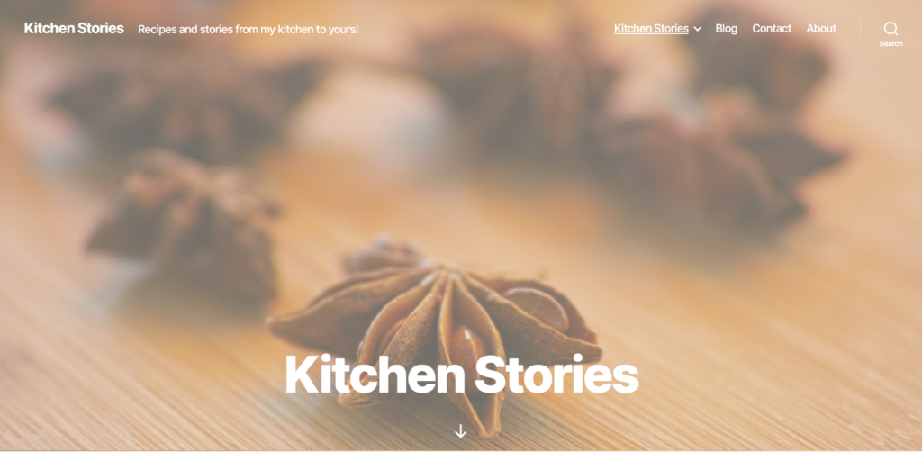
The “Cover Template” from the TwentyTwenty theme was used for this page. The header image is the featured image added to the page. The overlay color is set in the theme custom settings by going to Appearance->Customize.
The background color of the page can also be set in the customizer.
Category sections
The next section was created by using a group block that contains 3 columns, created using the columns block. The group block has a different background color than the page background which makes it stand out in contrast.
Each column has an “Advanced Heading” block from Kadence blocks plugin, an image block and a button block.
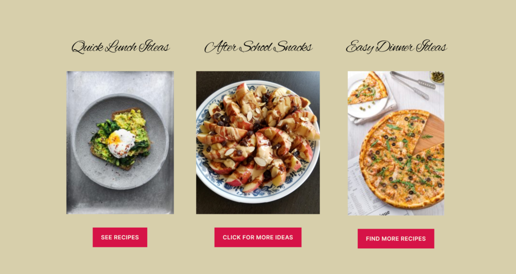
The advanced heading block provides options to set a custom font (font family) along with font size and line height. The font I used for the heading here is ‘Alex Brush’ which is a Google Font. This block also provides various other options like text-shadow and margins. Although the layout shown here does not have a text-shadow or a margin, it is easy to add them.
The buttons in this block can link to recipe categories like lunch, snack etc. This would be an easy way for the visitors to find what they need. Usually, when a visitor comes to a food blog, it is through a specific recipe link, but if they do land on the home page, this is an ideal way to send them to browse more recipes.
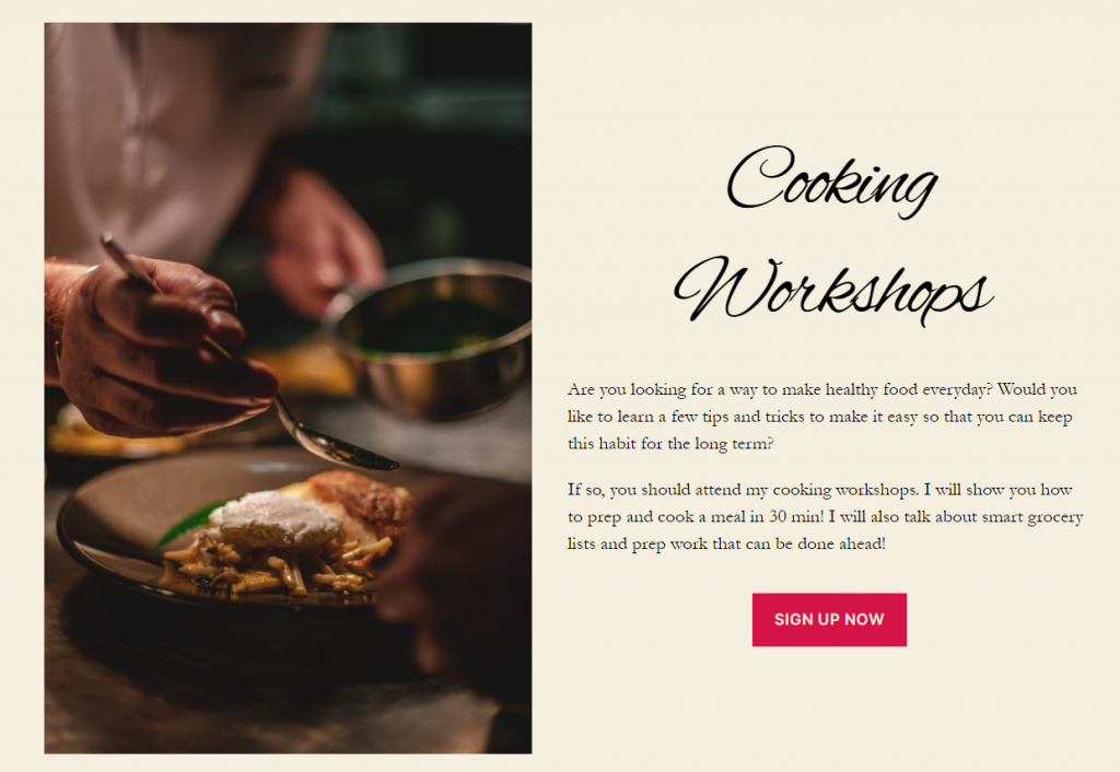
Call to action block – using the Media&Text block
The cooking workshops section was created using a Media&Text. The media part of the block can have an image or a video and the text part of the block can have multiple blocks if needed.
The text part of the block here shows and ‘Advanced Heading’ block from Kadence blocks, paragraph and button blocks. The heading has the same font as the section above it.
The button here is a call to action button that can be linked to a page. This block is ideal for a prize giveaway or as a link to your cooking videos. Save this block as a reusable block and use on other pages easily.
Latest Posts Block
The latest blog posts section is another group block with an ‘Advanced Heading’ block and a ‘Posts’ block from Stackable blocks plugin.
The block here displays the posts from the food category. If you add this layout to your page, make sure to select a category for the posts here.
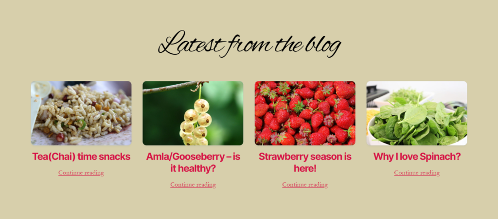
The advanced heading is similar to the other heading blocks and uses the same font.
The Posts block from Stackable, has more options compared to the ‘Latest Posts’ block.
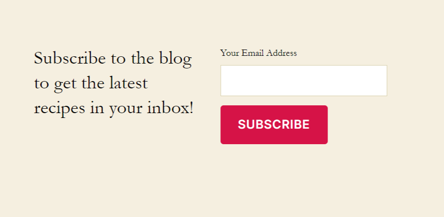
Email Subscription Block
The email subscription block uses columns with a paragraph block on the left and an email newsletter block from ‘Atomic Blocks’ on the right.
Atomic blocks provides with an email newsletter block that is connected to Mailchimp. To use this block, you need to connect your Mailchimp account by saving the api key in the plugin settings.
You can select the Mailchimp list when you add the block to the page.
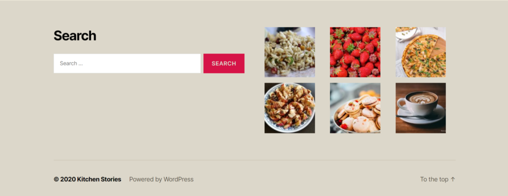
The footer has space to add widgets. The search widget was added to the left and the on the right side is an image gallery of the featured images of the recipe posts. These images are linked to the posts.
Adding this layout to your site
Modify this layout easily to match your site’s colors and fonts. You can download the code and add it to your page. Just copy the code and paste it into the code editor of your page.
If you are not sure about how to add the layout code to your page, view the video below.
Make sure you have all the necessary block plugins required for this layout to work. This layout uses blocks from Kadence Blocks, Atomic Blocks and Stackable along with the core WordPress blocks.
