This is next part in the series of Converting Shortcodes to Gutenberg Blocks.
Shortcodes have been part of WordPress for a long time. As the new block editor is gaining users and popularity, converting these shortcodes to blocks will be helpful. Gutenberg blocks are not only useful for creating custom page layouts, but also make the website building experience better.
When Gutenberg blocks can be used in place of shotcodes, it improves the overall user experience. As we are making this transition to blocks, we need to pay attention and make sure that the inspector controls are user friendly.
When converting a shortcode to a block, one of the first things to do is to figure out how you want to display the options in the sidebar. There is no one size fits all option here. The type of user interface we want to show ideally depends on the type of attribute.
I will use the business directory block as an example as it has many different types of attributes. Each attribute is shown in the Inspector Controls to give the user finer control over displaying their business directory listings.
Controls for simple list attributes
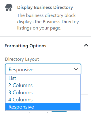
Some of the attributes like format, text, orderby, etc were easy to build in the block sidebar. These have a few static options to choose from and could be put into a select dropdown.
Options in the Shortcode:
'format' => 'list',  // options: list, grid2, grid3, grid4, responsive
'text' => 'excerpt', // options: excerpt, description, none
'orderby' => 'title', // options: date, modified, menu_order, rand, membership_level
Format options control in the block – all the available options are listed in the SelectControl.
const formatOptions = [
    { label: 'List', value: 'list' },
    { label: '2 Columns', value: 'grid2' },
    { label: '3 Columns', value: 'grid3' },
    { label: '4 Columns', value: 'grid4' },
    { label: 'Responsive', value: 'responsive' },
 ];
<SelectControl
label="Directory Layout"
value={ format }
options= { formatOptions }
onChange = {setDirectoryLayout}
/>
const setDirectoryLayout = format => {
    props.setAttributes( { format } );
};
Options with boolean values in the shortcode
Many of the shortcodes we use have attributes that take in boolean options – true or false. It might also be a ‘yes’ or ‘no’ to make it easier for users to understand and use in the shortcodes. The best way to display them in the block sidebar, is to use a toggle button. You can also use a simple dropdown which is easier, but I feel a toggle button is more intuitive.
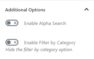
The business directory shortcode has the option to display the alphabet list at the top so that businesses can be sorted by their first letter.

The shortcode has it as a Yes or No option. In the block, the option can be simply switched on or off using a toggle button.
'alpha'	=> 'no',	//options: yes, no
'show_category_filter' => 'no', //options: yes, no

The toggle button did present a couple of challenges. The toggle button gives the output as true or false, but our shortcode needs the values ‘yes’ or ‘no’. So, the true or false values need to be converted to string values before being passed into our shortcode function.
Another issue was that the toggle attribute needs to be the type ‘boolean’ and the shortcode attribute was the type ‘string’.
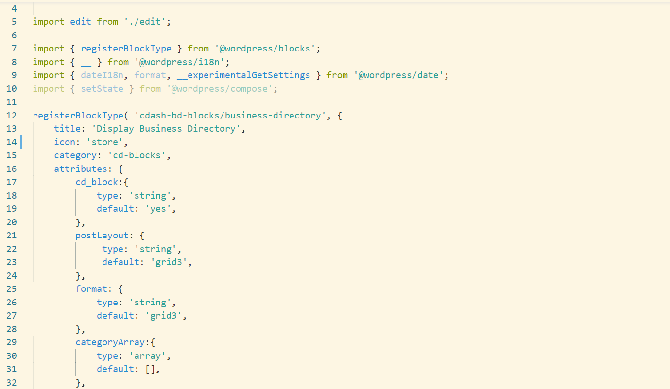
One of the important things to remember when converting shortcode to blocks is that we need to keep the name and the type of the attribute the same. As the original attribute cannot be modified in the block, I added another attribute ‘alphaToggle which is a boolean.
alphaToggle: {
  type: 'boolean',
  default: false,
},
The toggle button is displayed using the alphaToggle. When the option is toggled, the alpha option is set which gets passed onto the shortcode function.
<PanelRow>
    <ToggleControl
	label={ __( 'Enable Alpha Search' ) }
	checked={ alphaToggle }
        onChange = {setAlpha}
    />
</PanelRow>

const setAlpha = alphaToggle =>{
        props.setAttributes({alphaToggle})
        !! alphaToggle ?
        __( props.setAttributes({alpha: 'yes'}) ) : __(
        props.setAttributes({alpha: 'no'}) );

    };
This just needed a little bit of tweaking to make it more user friendly and intuitive. I also feel that the toggle buttons are easier to use than a dropdown sometimes as we can visually see which ones are “on” and which ones are “off”.
In the next part, I will cover the dynamic dropdowns for custom taxonomies and displaying toggle buttons for each option in a single shortcode attribute.
