WordPress 5.5 released on August 11th, features a few big updates for the block editor. The editor interface has some noticeable changes. The block directory is now available to install individual blocks with a single click along with the block patterns which provide a few layout options.
Editor Interface
The block editor interface has been improved a lot. It is more structured, with bigger buttons and a clean interface. The blocks don’t seem to be cluttered anymore.
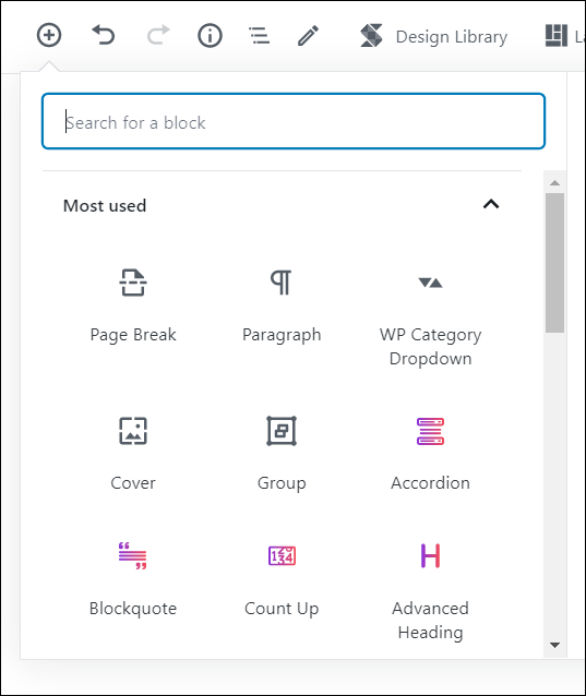
The ‘Add Button (+)’ on the top shows the blocks, block patterns and reusable blocks. In the previous version, the blocks were shown sorted by category in an accordion, but now though the blocks are displayed by category, they are not in an accordion anymore. I liked the accordion way of displaying the blocks. It was easier to get to the specific blocks I needed.
The list of blocks looks less cluttered, but I would have liked if the accordion didn’t go away.
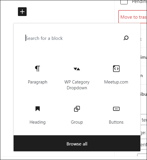
The add button next to the blocks in the editor shows recently used blocks and an option to search for blocks or browse all the blocks.
Easy to preview posts in multiple device widths
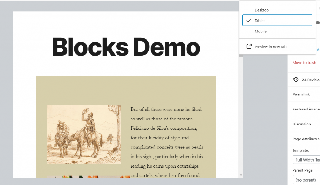
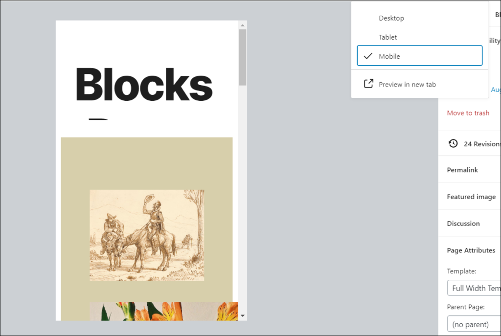
There is now an option to preview your post in Desktop, Tablet or Mobile inside the editor making it easy to build responsive pages.
Select parent blocks easily
One thing that annoyed me in the previous version is not being able to select the parent block easily. This has been made really easy in WP 5.5. You can just hover over the block toolbar to see the parent block and select it.
Moving Blocks
Moving blocks is a little different in this version. The previous version had a clear handle next to the block to move it. That handle is not available now, but you can use the up/down arrows or the ‘Move To’ option to move the blocks.
With the Up/Down arrows, click and hold on the arrows in the toolbar. That lets you move the block around.
There is a ‘Move To’ option you can see when you click on the three dots to the right in the block toolbar. Click on the ‘Move To’ option and use the arrow keys on the keyboard to move the block.
You can also get to the ‘Move To’ option entirely using the keyboard.
Block Directory
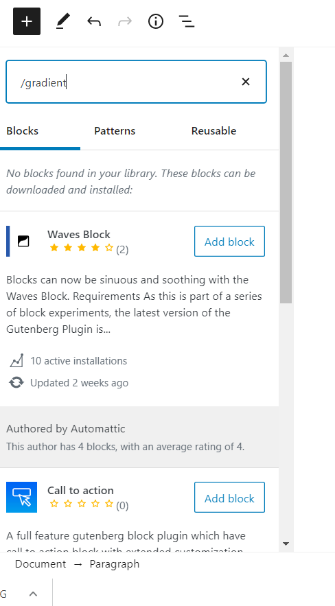
This is one of the cool features of the editor in this version. Block directory is similar to the WordPress plugin directory, but just for blocks. Until now, if we wanted to find a new block to use, we had to search through the available plugins and install them. These plugins usually have multiple blocks and even though we don’t need all those blocks, they are on our site as part of the plugin.
Block directory makes it easy to search for the particular block we need and install it without leaving the editor. These blocks are essentially plugins which can be found in the plugins page and deactivated and deleted from that page if we don’t need them.
Currently, there are only a few blocks available in the block directory, but the list is growing.
Block Patterns
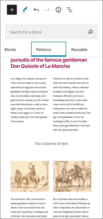
Block patterns are groups of blocks that can be added to your post or page with a single click. Once you add the pattern, you can edit it as you see fit. These patterns give you simple layouts using which you can quickly build page and post layouts.
Themes and plugins can add new block patterns too which will give us more options to build easy page layouts.
Inline image editing
I think this is one of the best features of this version. Being able to edit images inline in the editor makes it very easy for the users. You can now crop rotate and zoom the images after you add the image to the editor.
After you add the image, you can see a crop button in the toolbar. Clicking on the crop button gives you options to zoom in, rotate or change the aspect ratio of the image.


After editing the image, click ‘apply’ to save the changes. The image gets saved as a new image.
Let me know what your favorite feature of this release is in the comments!


